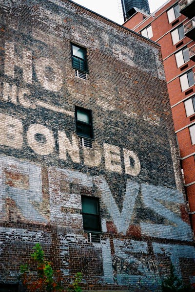
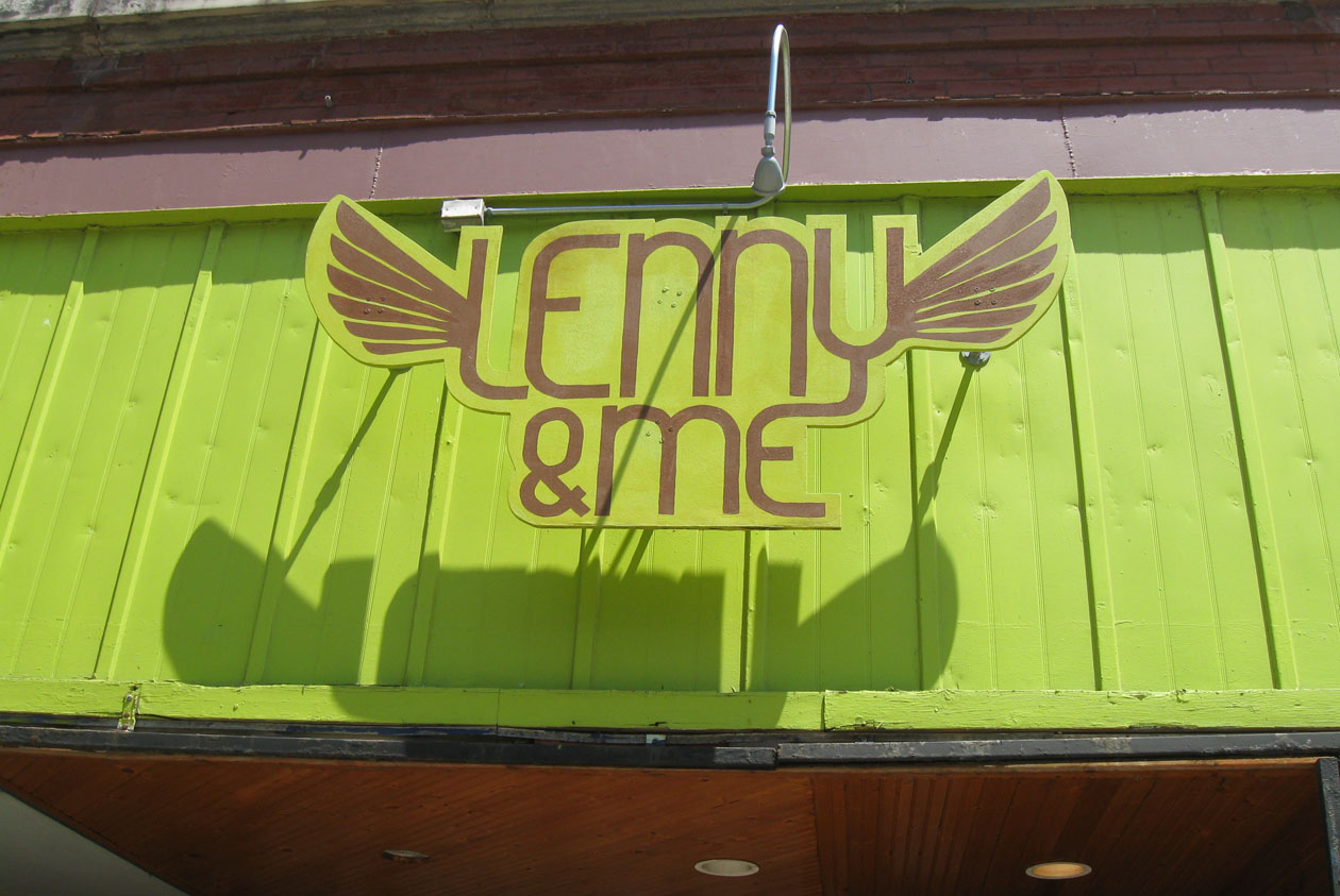
Thursday, May 22, 2008

News


In the Toronto Star today you will find an article about a person's preferred typeface. I was honoured to be interviewed alongside Rod McDonald. I thought it was going to be about how type influences people but it was more about the typefaces themselves — interesting. Under my picture is a quotation about what font the numeral 87 was, I mentioned I didn't know if it was a typeface per se, the rounded edges were probably so people wouldn't cut themselves and it was likely in the Helvetica or Arial genre of sans (particularly with the slope on the 7), I wasn't quite expecting to be quoted on that (yikes!) so please, I beg of all the type experts out there, don't rip me apart after reading this article! Overall, I thought it was an interesting read and I'm happy to see typefaces (not fonts, as stated through out) being discussed in the newspaper.

Also, last night I attended the typeclub to hear Rod McDonald and Dominic Ayre speak about digital typography, I will post a review later this afternoon or tomorrow.

Saturday, May 17, 2008

signs


Wednesday, May 14, 2008

Signs and posters from Munich.


Signs from Egypt.


"Wezaret el Tamween" - Ministry of supplements


"Souk El Maadi" - Souk is market, Maadi is a place on the southern outskirts of Cairo.

Sunday, May 11, 2008

Enter Exit


at a Rona's lumber yard

Thursday, May 8, 2008

MIA


I have been in Cuba, so that is why I haven't been updating the blog. Between Jenn and I, there will be lots of type from Cuba to be seen, like this one of a fishing boat in Havana named Anthony.

Also, I missed Patrick Griffin from Canada Type speak. If anyone was there, I would love if you posted a review.

some stuff from berlin from 'me'


more to follow soon...

Type TO

Ok so the first one isn't a sign but its interesting!


Tuesday, May 6, 2008

Cuba!

Here are a few shots from Cuba. There will definitely be more of these coming from Mandy soon.


Monday, April 28, 2008

one from Guelph

Wednesday, April 23, 2008

Toronto greys


This shot depresses me. Goodbye terrible, terrible winter.


I liked the greys. I wonder how many little birds nested in the mesh of these letters.


This pulled up in front of the Tim Horton's on a cold gloomy day, nice burst of colour. I like the guy having a smoke, probably waiting for his buddy to come back with a double double and a maple dip.

the old shipyards (near my office in amsterdam)


a funky petrol pump from amsterdam

Monday, April 21, 2008

HTO

by the man made beach area at the harbourfront. it is pretty nice down there now

Sunday, April 20, 2008

BY28 or RY28

Toronto, parking lot behind 20 Bay Street.

geogreetings from me


thought everyone might like this, an alphabet constructed out of letter shaped buildings over the whole world, have a go...

Saturday, April 19, 2008

All from New York... I've been trying to catch stuff on my cellphone camera. These are all from the past month or so.


The New Yorker sign, as seen though a stairwell at Hunter College's MFA studios.


Some washroom graffiti at Doc Holiday's in the East Village.


Closet hipster.


I love the word DeKalb.


From the Volta Art Fair show. Forgot the artist's name, sorry.


23rd Street 6 station.

Friday, April 18, 2008

Type Club Review Part 2: Ian Brignell

On Wednesday, the Type Club of Toronto presented Ian Brignell, a lettering artist and designer. If you haven't already heard of Ian you have surely seen his work, likely on a daily basis. From Burger King to Smirnoff to Estée Lauder, Ian has worked on everything.

After listening to his presentation I took away from it that he wasn't just a talented artist but an exceptional communicator, everything was clearly explained using case studies, personal references, showing his tools and an overall ease through his presentation. Like many of the other speakers before, he is meticulous with details (I see a trend) which is what really brings his work to that level of quality and makes him a master of his craft.

A lot of his work involved taking an older wordmark and updating it or softening it without losing its history, I do wish he had shown before shots to compare.

During all presentations at the type club there are always the typical type obsessed little comments and questions. During Ian's, it was about whether the curves were drawn by hand or computer rendered. I know designers and type aficionados are insanely obsessed with the details and technicalities (and I am not one to talk) but I wonder if the overall concepts and sheer beauty is lost on us when we get that obsessed, or does it only make our work better? Any thoughts?

The most important point Ian made all night was to rough out your work fast and in multiples to get the initial gesture and energy because you can't try and inject some energy later, it won't work.

Here are a few samples of Ian's work (all samples from his website):


More Toronto, Obviously.


Thursday, April 17, 2008


Just a quiet sunday in lower Manhattan.

Wednesday, April 16, 2008

corugations


Wanted: coupe magazine #15


If anyone has this issue of Coupe I would love to borrow or buy it from you, it's sold out on their website and it I really want it (for obvious reasons...read the cover lines)

NEWS: There is an event at the Type Club tonight, Ian Brignell: The Drawn Letter.

Monday, April 14, 2008

Ben's


Thought I would document this before it gets taken down. Was a Montreal landmark of sorts, one of those authentically old diners, stuck in time.

Saturday, April 12, 2008

Santa Cruz/ Caffee shop´s street

Friday, April 11, 2008

Queen West, after the fire


I'm sure this was visible before the fire, but I never noticed it until now...

Thursday, April 10, 2008

two random images from amsterdam


Monday, April 7, 2008

Wellington/Front


Saturday, April 5, 2008

CN bridge and some old hand-painted Highway Gothic


This sign is post-metric and pre-digital (PM / PD) which makes it... Old. Signs like this are generally one-offs so they were done by hand.
The obstetrical has been gone for some time.

Wednesday, April 2, 2008

1940s type

This isn't exactly "type in the public domain", but I thought it looked cool.


These pictures are from a booklet for an Olds trombone bought by a player (well, his mother) who then played the trombone in the US Air Force Band in 1945 (I now own the trombone - it is still in brilliant condition).


Tuesday, April 1, 2008

Cronos Container

Monday, March 31, 2008

Found in Buffalo

With Buffalo New York as the Host city for Typecon 2008, we present a few examples of found type around the city of Buffalo.


a Flickr group dedicated to more found type around Buffalo can be found here.

Saturday, March 29, 2008

Modern Living

In Scarborough.


Bilingualism at work in the nice logo integrating two languages

37

what about this numbers

Friday, March 28, 2008

Type Club of Toronto Review: Part 1


Okay, I am adding a little section that isn't found type related but I really wanted to comment on the great work that is presented by the Type Club of Toronto (and it's my blog and I'll do what I want). If you are lucky enough to be in Toronto and love anything to do with type and lettering, the Type Club is a must. If you live outside of Toronto, you can visit their website and read my ongoing reviews (I'll try and post the work as well or provide links)

I have attended three events (I unfortunately missed Karl Thomson). Here are my little reviews of the speakers thus far:

Peter Zak & Barry Lavender of Tweek
Barry and Peter create unique custom type and branding that stands out amongst the masses of digitally produced, "out-of-the-box" wordmarks and logos. They took us through case studies and revealed their processes of hand-rendering to digital-rending (and sometimes back to hand rendering). The most famous piece is probably the Indiana Jones movie lettering that Barry did earlier in his career and how that style of lettering was copied and interpreted over time. I really liked hearing Barry's stories in particular and was fascinated with his insane attention to detail. He will work on the smallest minutia of a letterform and the final product will look so spontaneous and natural. That is the beauty of his work.


(revealing process, image from tweektype.com)


(I don't think this is the original poster or even the original lettering but it gives you the idea)

--------

Michael Clark:
The hand lettering genius. He has done a wide range of projects from hallmark cards to identities. He is also known for typefaces like pooper black (one of the most ripped-off typefaces known) No screen does his work justice, you really need to see it in person. Some of my favourite stuff was done with thick broad strokes and stacked letters that almost looked abstracted beyond legibility. He talked about leaving his job to work in an art related career and started as a typesetter in an agency then secretly working on the creative at night and proving his talent. (I loved this story because I had a similar experience falling into a typesetting job at a young age and then becoming a designer). I am so jealous of this guys skills. The day after his talk I went to the art store and bought pen nibs, inks and paper and tried my hand at lettering, it was a mess... but I will keep trying.


--------

Doublenaut: Andrew & Matt McCraken
So far, this has been my favourite event. These two brothers focus primarily on music graphics and posters. The level of craft in their work is amazing and inspiring. I think there's a sort of push pin aesthetic to their work but it's like push pin thrashed by a skateboard run through the mud, then photocopied, scanned and then contrasted with clean modern elements. It all has a nice contrast and push and pull between quiet and loud, clean and grungy. Once again it was refreshing to see work that didn't totally rely on digital rendering but used it instead as a layer of design in their work. They talked about the importance of custom, original work as opposed to using imagery or typefaces available to everybody. I was impressed by how they scan old type specimens, customize them and work them into their wordmarks... even if the typeface is available digitally, this process gives them a completely unique look. Afterwards there was a raffle and I won the Indie Fonts 3 book and the typeface Artefact by Nick Shinn and I bought the XIU XIU poster from Matt (thank you!)


(posters from the Doublenaut site)

--------

Okay, that's it. Next speaker is Ian Brignell on April 16th and a review will follow.

Tuesday, March 25, 2008

a trip to downtown


That's some really big Arial, by the way.

Some more from a saturday walk