Monday, April 28, 2008
Wednesday, April 23, 2008
Toronto greys

This shot depresses me. Goodbye terrible, terrible winter.

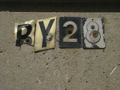
I liked the greys. I wonder how many little birds nested in the mesh of these letters.

This pulled up in front of the Tim Horton's on a cold gloomy day, nice burst of colour. I like the guy having a smoke, probably waiting for his buddy to come back with a double double and a maple dip.
Monday, April 21, 2008
Sunday, April 20, 2008
geogreetings from me
Saturday, April 19, 2008
All from New York... I've been trying to catch stuff on my cellphone camera. These are all from the past month or so.

The New Yorker sign, as seen though a stairwell at Hunter College's MFA studios.

Some washroom graffiti at Doc Holiday's in the East Village.


Closet hipster.

I love the word DeKalb.

From the Volta Art Fair show. Forgot the artist's name, sorry.

23rd Street 6 station.

The New Yorker sign, as seen though a stairwell at Hunter College's MFA studios.

Some washroom graffiti at Doc Holiday's in the East Village.


Closet hipster.

I love the word DeKalb.

From the Volta Art Fair show. Forgot the artist's name, sorry.

23rd Street 6 station.
Friday, April 18, 2008
Type Club Review Part 2: Ian Brignell
On Wednesday, the Type Club of Toronto presented Ian Brignell, a lettering artist and designer. If you haven't already heard of Ian you have surely seen his work, likely on a daily basis. From Burger King to Smirnoff to Estée Lauder, Ian has worked on everything.
After listening to his presentation I took away from it that he wasn't just a talented artist but an exceptional communicator, everything was clearly explained using case studies, personal references, showing his tools and an overall ease through his presentation. Like many of the other speakers before, he is meticulous with details (I see a trend) which is what really brings his work to that level of quality and makes him a master of his craft.
A lot of his work involved taking an older wordmark and updating it or softening it without losing its history, I do wish he had shown before shots to compare.
During all presentations at the type club there are always the typical type obsessed little comments and questions. During Ian's, it was about whether the curves were drawn by hand or computer rendered. I know designers and type aficionados are insanely obsessed with the details and technicalities (and I am not one to talk) but I wonder if the overall concepts and sheer beauty is lost on us when we get that obsessed, or does it only make our work better? Any thoughts?
The most important point Ian made all night was to rough out your work fast and in multiples to get the initial gesture and energy because you can't try and inject some energy later, it won't work.
Here are a few samples of Ian's work (all samples from his website):


Wednesday, April 16, 2008
Wanted: coupe magazine #15

If anyone has this issue of Coupe I would love to borrow or buy it from you, it's sold out on their website and it I really want it (for obvious reasons...read the cover lines)
NEWS: There is an event at the Type Club tonight, Ian Brignell: The Drawn Letter.
Monday, April 14, 2008
Ben's


Thought I would document this before it gets taken down. Was a Montreal landmark of sorts, one of those authentically old diners, stuck in time.
Saturday, April 12, 2008
Friday, April 11, 2008
Thursday, April 10, 2008
Subscribe to:
Comments (Atom)


