Wednesday, November 28, 2007
Tuesday, November 27, 2007
Monday, November 26, 2007
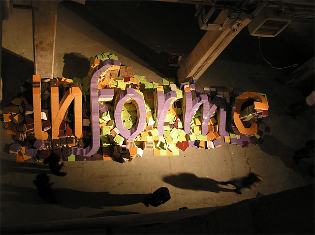
Uppercase Gallery TYPE BLOCK project

I meant to post this earlier (but I forgot). I think everyone on Villatype should submit something, it's an amazing idea and project.
Here are the links and info:
Project instructions on Typophile
The Flickr group to upload and view submissions
Uppercase Gallery (curating the project)
(Thanks to Nick Shinn for the tip)
Randoms from Toronto

I love these giant house numbers and I love this house. At the corner of Richmond and Palmerston

Taken on Toronto's first snow day, it was pretty grey and gloomy out and I was drawn to all the colour and chaos of this place.

Wicked says it all

Pretty apartment building in Roncesvalles

Cool gallery and type on Queen street

Also in Roncesvalles, "Aspen" set in this font reminds me of all those 80s teen ski movies.
Sunday, November 25, 2007
Carved, Painted & Embedded
Tuesday, November 20, 2007
Chicago type
can't remember if this has been posted already or not, but here is some found type from Chicago
Sunday, November 18, 2007
The relationship between type and advertising
This weekend I read an article about Sao Paulo's ban on advertising in the city, including eliminating things like the golden arches from the McDonald's sign, so that the only thing remaining were the letters in the sign. As an unanticipated public policy effect, it made me wonder if the long term effect of not allowing advertising (including logos) would cause businesses to invest more in typography as a means to identify their brand.
If more major cities followed Sao Paulo's lead, would more businesses reevaluate the typography chosen for their business? Major corporations can often be identified by their fonts without their logo, so they may not be bothered with a rebranding campaign of their font. However, smaller businesses may look to unique fonts to separate themselves from their competition. Could banning ads produce a new renaissance in typography?
Sao Paulo: A City Without Ads

Enter/No Parking
Saturday, November 17, 2007
Thursday, November 15, 2007
typeworkshop

I just came across the stunning work of typeworkshop.com on ffffound! and am amazed by the nature of their workshops, seemingly catering to casual spotters and hardened typesetters alike, creating stunning public type experiences. Their workshops are very well documented, eliciting a great visceral 'I really wish I could be there' feeling in my design-bone.
Wednesday, November 14, 2007
folk typography
nice flickr found type pool here http://www.flickr.com/groups/folktype/pool/
Monday, November 12, 2007
small town type
super-script

This site is insanely cool, especially this project. I love using pixely grids in unexpected ways to create imagery (usually in stitching and knitting) and the painting on the sewer grates and on the house is an amazing inspiration!
Tip: typeforyou.org
Friday, November 9, 2007
Paula Scher — Type is Image

Here is the link (blogger isn't letting me embed video today) http://youtube.com/watch?v=TdzzVeIdwpQ
Here is a great little video on youtube of Paula Scher talking about her design process and how she uses type. I thought I should post it since it shows many examples of her work in New York city, particularly the Public Theatre identity she create which has sinced become a very popularized and copied style that can be seen on many street corners. Also, her paintings shown at the end are very intense, a good insight into her brain.
Sunday, November 4, 2007
A few randoms

Good old cooper black. However, it should say "please wait hours to eat and just eat whatever we serve you"... bad brunch experience

This little subway sign is in Toronto outside Bloor station, it doesn't look like any of the TTC signage and the blue is confusing. Maybe it's one of a kind. BTW, I missed the TTC typewalk because brunch took many hours (see above). Hopefully I will catch the next one.

This is more like it (found underground at entrance to Bloor station)

So long sweet summer (sigh). Taken at the foot of Spadina on Queens Quay
Subscribe to:
Comments (Atom)


