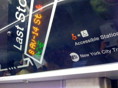
So admittedly not strictly type, but I couldn't help share this little beauty from the brand-spanking new L-trains in NYC.
We've now got digital route information signs giving riders information about 'next stop', 'connecting routes' etc...
What I love is the legend at the bottom right that shows you the little digitized wheelchair icon, and how it equals the drawn wheelchair icon, and then how that equals "Accessible Stations". Isn't an icon an inherent failure when we need a legend to show a more clear picture of the exact same icon and then to also actually spell out what that icon means as well?
(ontop of that the LED wheelchair is red while the picture of the LED wheelchair is orange...)

4 comments:
no love for the L train today. There was a yelling match between two fat ladies between Lorimer and 14th Street. Entire car was telling them to shut the F up or get off the train.
Then the doors broke, and the conductor had to get out and manually close certain doors.
I bet that went through a few committees. I think the digital icon works fine on its own. The question is, is there a sexy lady voice accompanying the names of the stops as the TTC has recently done?
http://www.emmaclarke.com/media/7136/would-the-passenger.mp3
http://www.emmaclarke.com/fun/mind-the-gap/spoof-london-underground-announcements
sometimes a word can be worth a 1000 icons :)
I count a 5X7 dot matrix in that LED font. Not much you can do for detail with that.
Post a Comment