Sunday, September 30, 2007

NYC Type Walk

I was one of the lucky 22 that managed to snag a ticket to the AIGA sponsored type walk on the weekend lead by Tobias Frere-Jones of Hoefler & Frere-Jones and who some of you may recognize from the helvetica film. His typographic expertise and the fact that he was born and raised in NYC helped to make this a great event!

The title link will bring you to many more tagged pics at flickr from the walk (likely some damn good ones as quite a few people had telephoto lenses. Here are my fantastic point-and-shoot pics, and some of the points made by Tobias during the talk/walk...

AMERICAN LEGION
This old American Legion sign shows off "Aluminum Channel Letters". Around the 1920s neon lettering began being introduced from France. For a while it was all the rage as it was fresh and new. Pretty soon neon filled streets were seen as an eyesore and some areas started banning it and generally people started using it less, while simultaneously it began be be seen as tacky and seedy. This can be seen today as neon lettering is common for liquor stores and XXX porn shops.
Also of interest in the lettering is the quite rare extended geometric sans... and the curiously non-extended "c".


ANNA ESPOSITO
Around the turn of the century many buildings were commemorated to wives and daughters and their names were incorporated into the buildings. These were done by bending tin over wood cut letters. The technique obviously affected the detail and shape of the letters/serifs. The molding of the overhang was also created in the same manner and truely integrated the type into the architecture.


BOWERY SAVINGS BANK
The first pic shows old-school casting of individual letters above the more recent casting of an entire plaque.
The second shot shows up high the location where cast letters had once been placed up high on the building. Seems ridiculous to place detailed type this high up until you realize that there used to be an elevated train that ran down Bowery street, and the train would have stopped right infront of this bank.


CUP AND SAUCER
An example of perhaps the last remaining punched/embossed stell with prism surface in lower Manhattan.


ABC
One of the first forays into plastic molded letters. On the north side of the street and incredibly faded. This fading has made the brush stroked in the black 'ELE'ctrical type visible. Even the extra strokes done to cleaning finish the edges of the letters.


GERTELS BAKERY
"Gaspipe" lettering which are characterized by curving of any possible strokes and rounded ends. Easier to do with a brush.


IDEAL HOSIERY
The corner shot shows the fading which occurs with the east facing side vs the north facing side.
Sign painters would more often paint a drop shadow dropping off to the left rather than the right to make it easier and quicker. In the set of capitals there are 12 letters with a straight edge on the left and only 4 with a straight edge on the right.


LIQUOR
Why the crazy width on the vertical strokes in the liquor store sign you ask? So you can still read the sign from waaaaaaaay down the block.


GOTHAM
And now I leave you with three of Gotham's direct relatives,
See more images and read about the birth of Gotham at the Hoefler & Frere-Jones site.


Saturday, September 29, 2007

big news


Type made from newspapers on railway fence, demonstrating against house building in semi rural areas in Sweden.

new piccadilly


lovely 50's cafe, the New Piccadilly (London) closed last week. i had the chance for a last cuppa and a couple of snaps of the exterior before it's demolished. more London pics to come...

Friday, September 28, 2007

Fish from Finland


In an old, small, Swedish-speaking town in Western Finland each block used to have a different fish assigned. This tradition is kept in the old, wooden part of the town and the different types of fishes are drawn on the corresponding blocks.

Wednesday, September 26, 2007

Bakery


Here is a shot sent to me by Mike Langlie. It looks like it's been cut and pasted a few times. It's so wrong yet so right. Thanks Mike.

Tuesday, September 25, 2007


Here is a great link to a flickr group called Fontspotting by Olof Werngren. I am amazed at how many people are creating online forums to discuss public typography. (Photo from flickr group)

Monday, September 24, 2007

Typotrip


Here is another great type blog to check out, sent to me by Wojtek Mejor. Thanks for the link and thanks for adding villatype. (photo from the typotrip blog).

Style Wars


If you have the time, watch this documentary on New York graffiti circa 1983 (you can watch it for free on google video). It delves into the old argument of art vs. vandalism — a very fitting topic for this blog. It's particularly interesting to hear the 'writers' and 'bombers' talk about lettering style and composition and it's pretty amazing to see where these styles originated from and by whom. You can see these styles reflected, copied and often mutilated in many contemporary "graffiti style" typefaces.

The Style Wars website is also very beautiful.

Thursday, September 20, 2007

safari typographique


I came across safari typographique by Étienne Mineur on le typographe and I think the collection of type is amazing. Please check it out. (Image shown is from Hanoi, Vietnam)

Links from Porchez


Jean François Porchez sent me this link to his found type shots. Image shown above is from this site. I also added it to the side bar.

He also posted a bit about Villatype on le typographe and featured one of Kavel's shots from Paris. Merci!

Porchez designed Parisine and Apolline, two of my favourite typefaces.

Wednesday, September 19, 2007

Juxta-puke-ition

On Parc Ave., I'm not really sure what the building was used for prior to being a glorious coffee-internet-amusement shop with insanely stretched type, for some reason I want to say fire station but "& Co." implies some sort of office. I also have no idea what the numbers are for... 32... 68... you would think address but the address next door is in the 3000's.

Here's a close-up... funny/unexpected tail on the R!

Retro Reitmans

I had noticed this old Reitmans billboard signage while waiting for one of very many red lights on the extra-traffic-filled Decarie Blvd.


From my highly limited Reitmans knowledge, there used to be a department store in this area in the 40's. I can't tell what is there now. The logo feels very art deco to me. I love how the angled end of the cross stroke of the "t" falls to the angled "a" and the wonky "s"...


... and here's today's logo for comparison.

random type in my hood


off an old car near my house. love that swan! (although it's supposed to be a pelican)


garbage bin near the grocery store. it ain't perfect, but it sure is pretty for a garbage sign.

Tuesday, September 18, 2007

The Crossways

This is a mall/apartment building across from dundas west station. so many typefaces, so little time.

Monday, September 17, 2007

Queen Street Monday

These shots were taken upstairs at the Gladstone on Queen W.

Chairs with advertisement for spa:


3D Illustration entitled Vancouver Flight (found in the ladies rest room), creator unknown:


Sunday, September 16, 2007

Wednesday, September 12, 2007

The John Ryan Cross Canada Tour

John just returned from said tour and sent me some amazing shots. I am going to span his post over a few days. I'll start with the Winnipeg Exchange District. See John's comments below each image.


I liked the way they painted the type into the arches and depressions on this wall.


So butch I love it. A welder's attempt at on-the-spot type-setting.


As much for the typeface as the typo


Classy slab


More Winnipeg Exchange District


(photography by John)

Tuesday, September 11, 2007

Views of Montreal

I, too, was in Montreal this weekend. Here are some of the "hits".

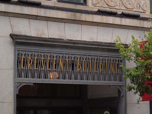
Downtown building entrance


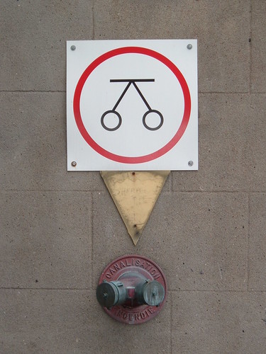
Fire hydrant signage


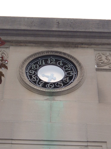
Clock at McGill University entrance


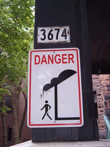
Danger: falling spikes


Watch out for Handball


Odds of getting a parking ticket here - 1:1


Flower shop sign


Apartment building entrance