Thursday, August 30, 2007

words on windows


this is some writing on a department store window stockholm.
maybe you'll like this site...pictures of walls

Wednesday, August 29, 2007

Villatype link

Villatype has been linked to this site. Scroll to the bottom.

Queen West Wednesday?


I missed the Queen Street West Monday post but here is a shot anyway from my fancy new camera. It's not very fancy but I am pretty excited about it. I heard Emma got a new camera so I hope to see some type shots soon.

Tuesday, August 28, 2007

Sunday, August 26, 2007

Egypt


Found these shots from my trip to Egypt back in 2003. From top: Arabic McDonald's in Sharm el Sheik, interesting hyphenation in Coptic Cairo and a utility box in the suburb of Maadi.

After taking a photo of the U.S. embassy, I was held by police. In order to keep my camera (and secure my freedom), I had to delete a lot of my type photos. They didn't understand my interest in signs - and thought I was up to something. Somewhere in Cairo, there's a file on me.

Better with Age


Here are some great images that Nick Shinn sent me. I think the LIMITED with the barbed wire is my favourite. I also posted his found type photo essay The Helvetica Meditations on the side.

Remember, you can click on images to see them larger.

Thanks Nick!

(photography by Nick Shinn)

Thursday, August 23, 2007

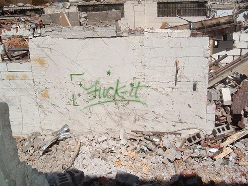
If you say so

I really like this graffiti on this building. The curvature of the graffiti suggests femininity. Most tags have very sharp, angry lines (presumably done by angst-ridden teen boys), but this one has some smoothness that suggests a lot of sass. I like how it stands alone in the rubble of a normally masculine building.


(photo taken by me, June 2007. It was the side of old Ritchie's building on King East half-way through demolition)

Capstan Sundial


This is from the RCYC on Toronto Island. It is a detail of the Capstan Sundial commemorating the fallen soldiers of the Royal Canadian Yacht Club.

Wednesday, August 22, 2007

Canada Malting Co.


This abandoned plant is right around the corner from my place. I love the type and the building, especially among the fancy new condos going up, it's a nice juxaposition. Click here to read about its history and a "how-to-guide" on infiltrating the building

type the sky


thought this might be of interest...

Tuesday, August 21, 2007

negative type

i like the cut out type in the last post, 'ONE'. here's another ...

Monday, August 20, 2007

Queen Street Mondays (part 1)

Jenn provided me with many samples of Queen street taken about two years ago for a project she worked on with Chryssi and Lisa G. There is over 60 of them so instead of posting them all at once, I will do a Queen St. W post every Monday. I think these images are super fly ladies! I want to hear any background stories on the day you all went out to shoot them.

Here is the first batch:


(photography by Jenn)

Friday, August 17, 2007

paris summer


some images from Paris.
1. metro signs, love the numbers.
2. door number 86 and layers of paint.
3. grand.
4. diner, this sign casts fantastic shadows.
5. and finally, abbesses metro station, repeated.


Thursday, August 16, 2007

1st from Sweden


I have two from my local square in Årsta, Stockholm, Sweden.


Frisör means hairdresser. The sign is from a conservation area, the whole suburb was built in 1947 and most of the original signs have been kept.


The other ones a lottery poster, this weeks jackpot 2,4 million kronor.

Winnipeg’s Exchange District: Canadian Design Resource


This post from the Canadian Design Resource is over a year old but it's a great image (I'm just showing a sneak peak). Winnepeg is home to some good type.

On another note, I pre-ordered the Helvetica dvd... weeee

Wednesday, August 15, 2007

Smartest Town Ever


This is in Chaffey's Lockes, the itty bitty town on the Lake with my cottage.
It may seem like a little place that's a bit behind the times, but they are real pregessive with their signage and waist no time when it comes to recognizing good design and interesting type, if only Toronto would take a hint from Lake Opinican.

Soup Can


This is also, in Chaffey's Lockes on lake Opinican in the Genereal store. Upon first seeing these cans I thought they must have been on that shelf for about 3 decades, but upon further examination they have a pull tab on top, a rather new can opening convenience.
So needless to say I love these little anomalies

Monday, August 13, 2007

Slow Children


This photo was taken at the entrance to the cottages of Pine Lake where my family stays every year. The lack of punctuation makes this sign a classic.

(photo by Mark Rigley)

Saturday, August 11, 2007

The New York Times Sunday Magazine has posted a great article and a slide show about the change in fonts from Highway Gothic to Clearview on US Highway system signs:

The Road to Clarity (article)

"...as the idea of branding has claimed a central role in American life, so, too, has the importance and understanding of type. Fonts are image, and image is modern America."

What's Your Sign? (slideshow)

Wednesday, August 8, 2007

Montreal: part 3

The Point à Callière gallery in Old Montreal housed some great type (and probably some ghosts, although we never actually saw them):


Here are a few more gems (below):


(photography by Jenn)

Le Paris

Photos taken during a 2-day Parisian adventure, including métro signage, restaurant/café signage, and signage at the Centre Pompidou. Oui oui, pain, fromage, vin!